Don't Use These Fonts in Your Designs: Try These Fresh Alternatives
Stand Out in Figma: Unique Font Choices for Your Designs
In the competitive world of design, standing out is crucial. One effective way to distinguish your work is by selecting unique fonts that are less commonly used. Moving away from overused fonts and choosing new alternatives can give your designs a fresh, distinctive look. Here’s a guide to help you make better font choices in Figma.
Avoid Helvetica; Choose Jakarta Sans or Satoshi
font download :Jakarta Sans or Satoshi
Helvetica is a classic, but it's also ubiquitous. To give your designs a modern edge, try Jakarta Sans or Satoshi. These fonts offer a clean, professional look while adding a touch of uniqueness.
Skip Comic Sans; Opt for COMICO
font download : COMICO
Comic Sans is often criticized for its unprofessional appearance. If you need a playful yet polished font, COMICO is a great alternative. It maintains a fun aesthetic without compromising on readability.
Replace Futura with Jost
font download :
Futura has been a go-to geometric sans-serif for decades. For a fresher feel, consider Jost. It retains the geometric precision of Futura but with a more contemporary twist, making your designs feel modern and innovative.
Swap Times New Roman for Krylon
Times New Roman is a staple in many documents, but it can appear dated. Krylon offers a sophisticated and modern serif alternative, perfect for maintaining a classic look with a current feel.
Trade Arial for Clinton
Arial is widely used due to its versatility, but this also makes it common. Clinton provides a similar level of flexibility with a unique flair that can help your text stand out.
Substitute Poppins with Kollektif
Poppins is known for its rounded, friendly appearance. Kollektif offers a similar warmth but with a more distinctive character, making your designs more memorable.
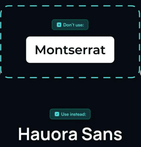
Exchange Montserrat for Hauora Sans
Montserrat is popular for its bold, urban look. Hauora Sans provides an equally strong presence with a slightly different style, helping your work to stand out in a sea of Montserrat users.
By thoughtfully selecting fonts that are less commonly used, you can create designs that not only look professional but also stand out from the crowd. Experiment with these alternatives in Figma to see how they can enhance your projects.
images owned by @sprrrintdesign


0 Comments